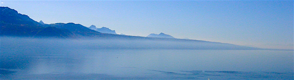


It has actually been more than a few decades that I have looked at this area again, that is looking at more than the melting of permafrost. I am systematically going through my slide collection taken during my field work in 1969 and 1970. It is an interesting puzzle to locate the images on Google Earth. Sometimes it proves too much of a challenge. The helicopter photo below shows the shoreline of Playgreen Lake, on a flight line bringing us back to Norway House. We were flying a Bell 47 helicopter which has such a marvellous view to take pictures.

Strangely enough I could not find the accurate location where the photo was taken, not on Google Earth, Apple maps or Bing. Fortunately, I still had a 1954 1:70'000 scale aerial phots for this area. The red dotted lines on the 1953 aerial photo below show the area covered by the colour photo taken from helicopter. (National Air Photo Library photo: A13933-20)

The Google Earth image below is dated 1984!!!. The aerial photo date is 1953. The amount of shoreline erosion is quite dramatic.
The longest red line represents about 450 meters in erosion; the shorter line on the right is about 175 meters in shoreline erosion. This means-for this stretch of shoreline an annual erosion rate of 5-15 meters. How much of this can be contributed to the Churchill- Nelson Diversion, in particular the Eight Mile Channel which was constructed in the early to mid-seventies.

The Google Earth overview and 'transparent overlay of the 1953 aerial photo gives a good overview of the situation. The red arrow shows the start of the Eight-Mile Channel constructed by Manitoba Hydro in the mid-seventies. The water flow in Playgreen lake can easily be determined by the surface water tones reflecting suspended sediments: the erosion from this area appears to flow directly in the Eight-Mile Channel.

How much of the erosion did take place between the 1953 and the date of the helicopter colour photo- 1969? This could be seen as an approximation of natural erosion processes. The yellow dotted line on the image below shows the shoreline location based on an interpretation and comparison of the 1996 and 1953 photos. Using the Google Earth measuring tool, the amount of erosion varies from about 66-84 meters, for the 16 year period. Or an average annual basis this would be about 4-5 meters per year.

The figure below shows a combination of two satellite images and the 1953 aerial photo. 1984 is the Google Earth base and the Apple Maps image is superimposed and made semi-transparent. The shoreline erosion in the later time period has slowed down significantly. The maximum measured was 50-60 meters (around the red bar) and 20-30 meters on the right side of the wetland. This would amount to between 1 and 2+ meters per year.

The 1974 (July 4) satellite image (below) processed by the Canada Centre for Remote Sensing gives a good perspective of the Playgreen Lake situation during the construction of the 8-mile channel -top yellow arrow- and the 2-mile Channel -bottom yellow arrow. The white arrow point to the eroding area described above. The flow of suspended sediments is clearly visible in this colour combination of Landsat bands 5,6 and 7. Natural erosion processes are certainly significant in this area of predominantly lacustrine clays and silts

In one of my early papers (Thie et al., 1974) I analyzed a 1973 satellite image and interpretation with provide an interesting background for this study. This image below was taken on 20 September 1973 -(CCRS number 1424-17082). The delineation on this image is based on shoreline configuration, water distribution and water reflectance. The continuous lines identify major physiographic regions. Broken line delineate different water spectral reflectance signatures that appear to have relations with physiographic sub-units. While most of the reddish water colours are related to suspended sediment levels, few of these near 'e' are shallow waters.

REFERENCES:
- Thie, J., Tarnocai, C., Mills, G.E., Kristof,S.J., 1974: A Rapid Resource Inventory for Canada's North by means of Satellite and Airborne Remote Sensing, in proceedings of the Second Canadian Symposium on Remote Sensing, University of Guelph, Guelph, Ontario, April 29 - May 1, 1974
The Manitoba Wildlands organization provided the map below showing, among others, the Churchill-NeLson Diversion area.
